Featured Sites
If you're here for quick links, here's a shortlist of the full-site design-implementation work that I'm proudest of. You can read more about my work on each of these below.
All WordPress work was crafted using fully custom themes — no page-builders, pre-builts, or child themes. These designs were crafted by an in-house or external designer and handed to the development team for implementation.
-
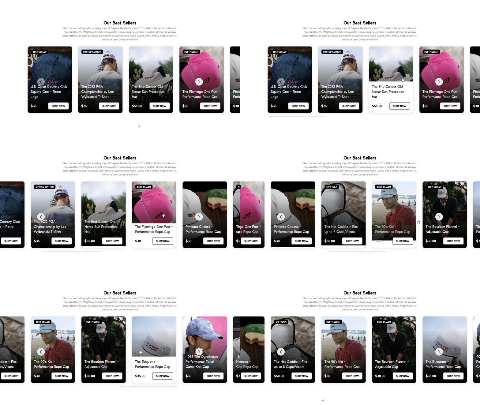
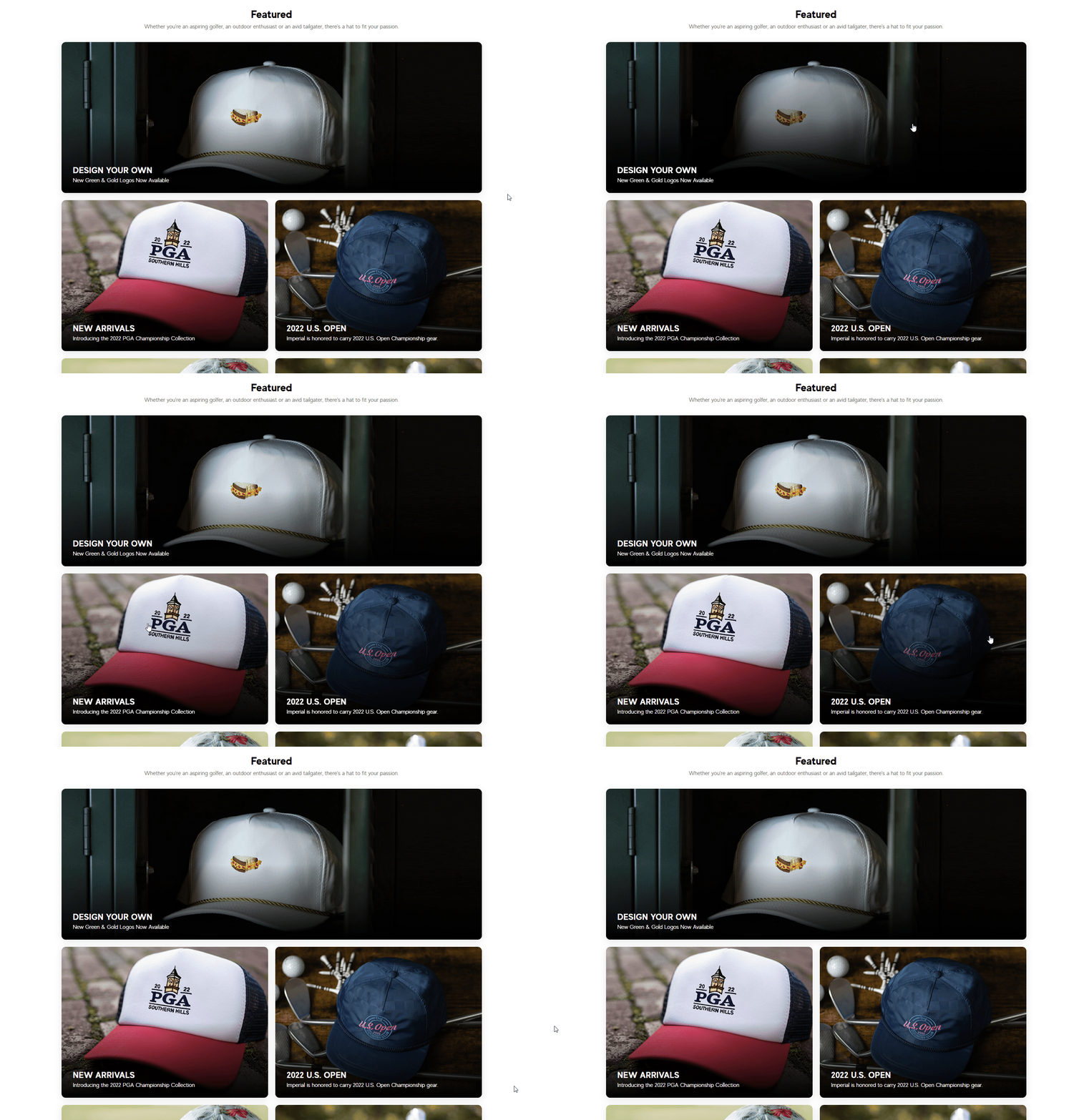
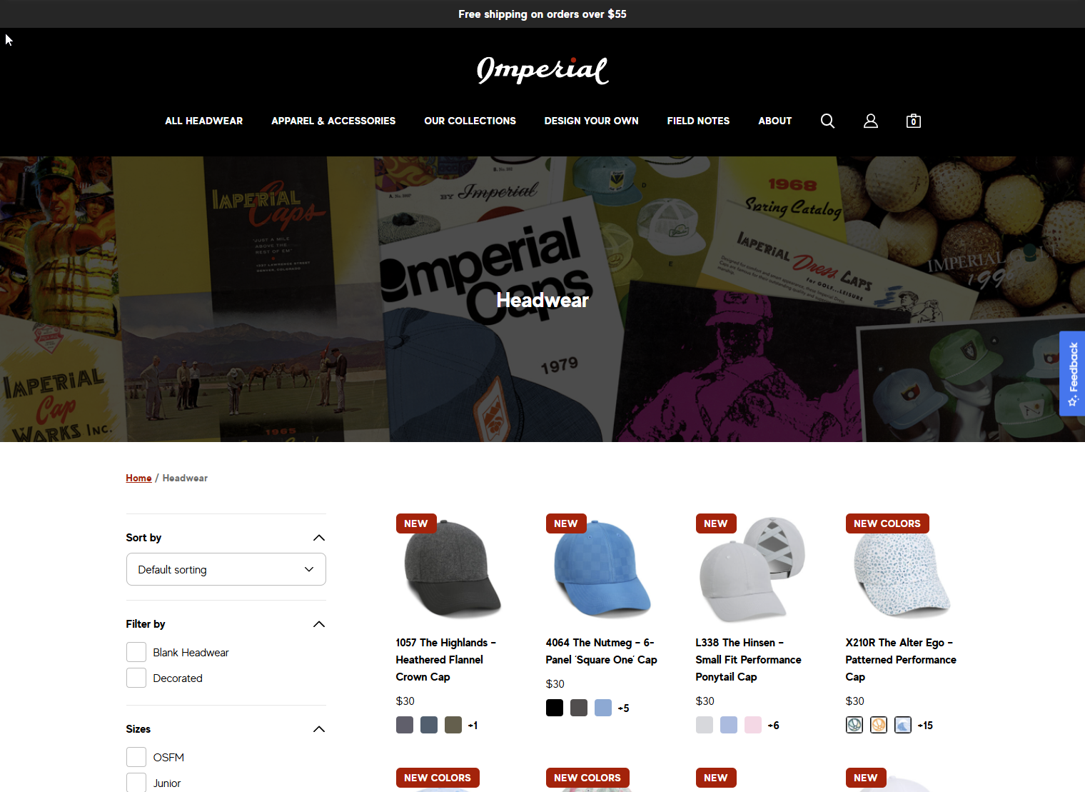
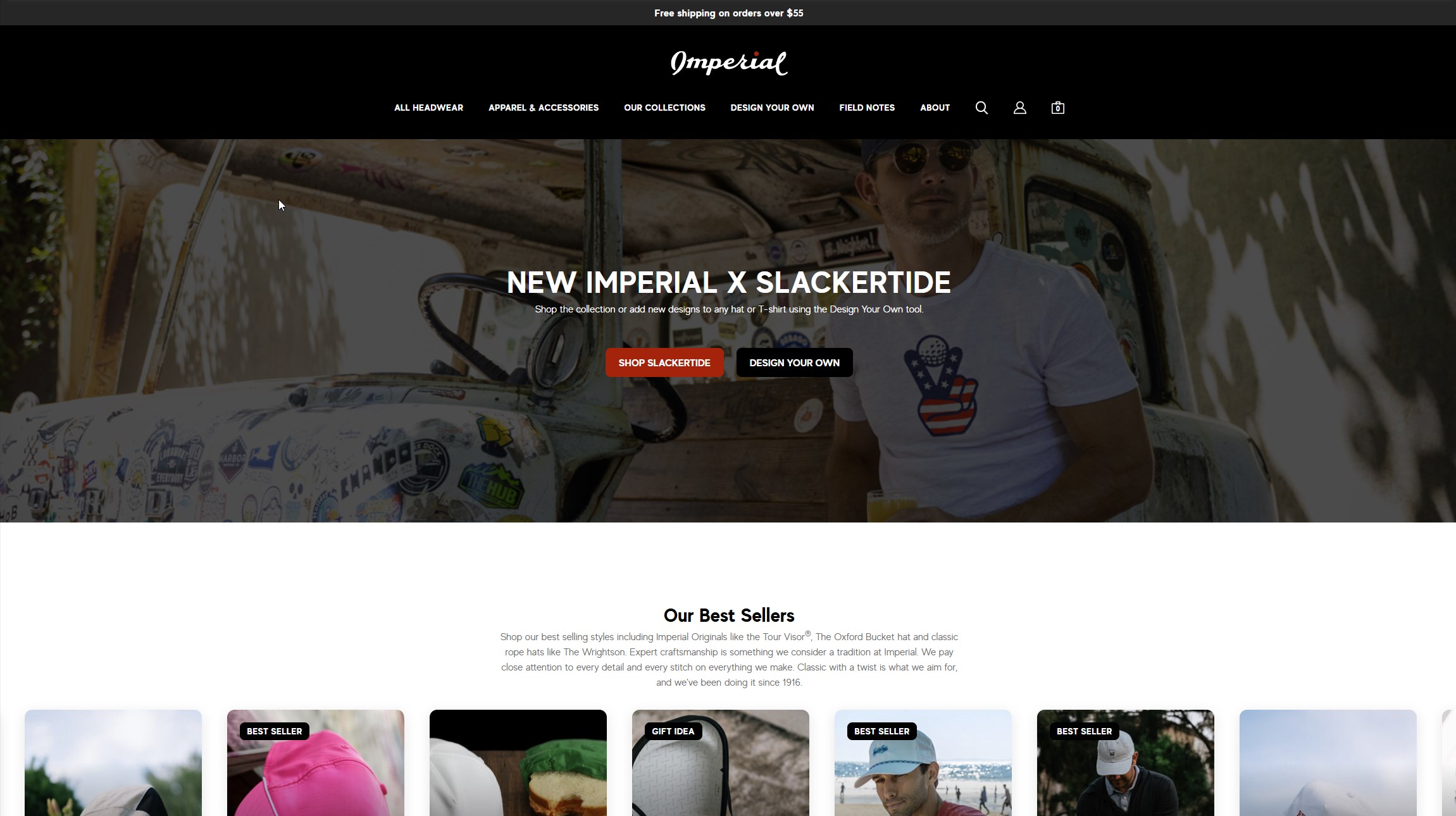 Imperial Sports: A sophisticated e-commerce site for sports hats and other performance apparel.
 -
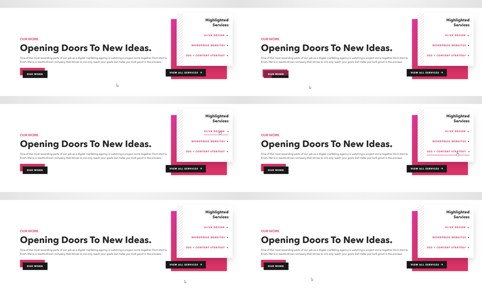
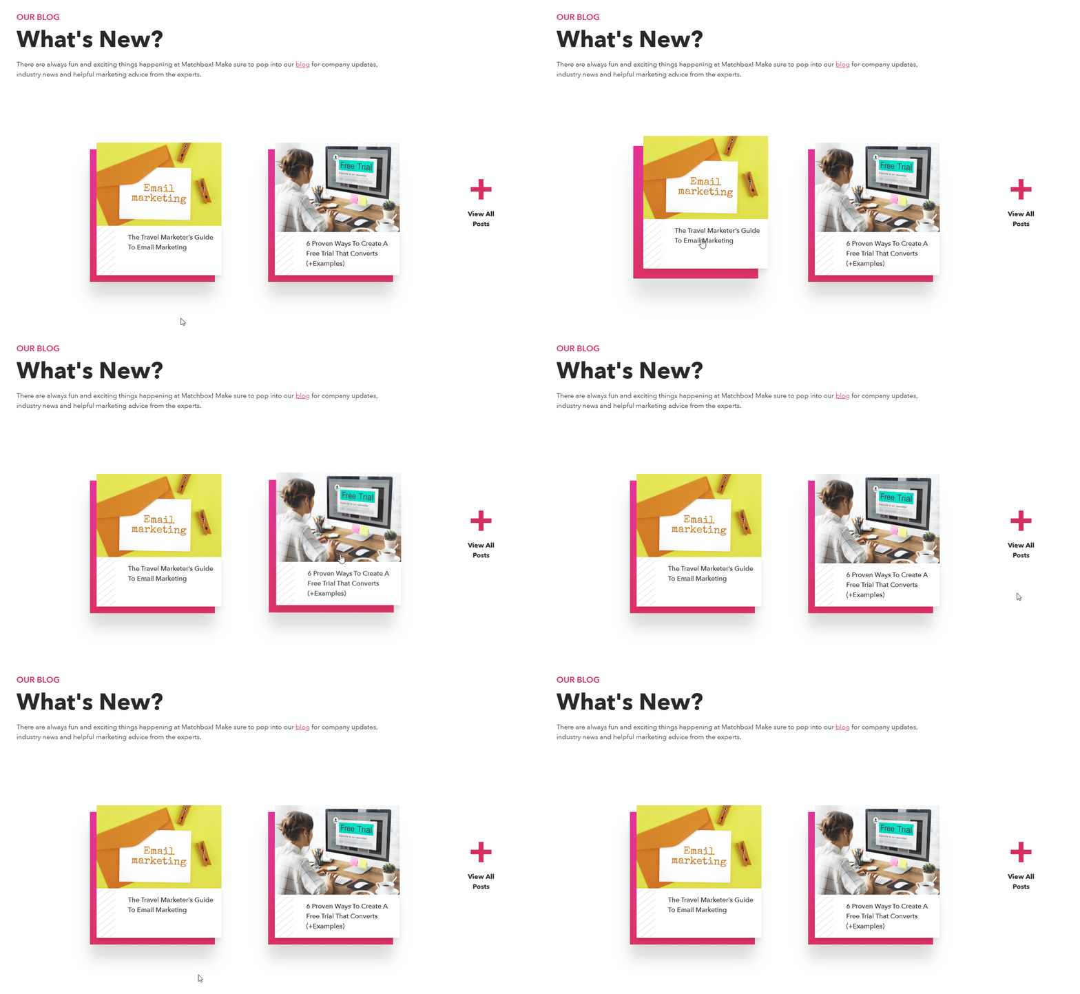
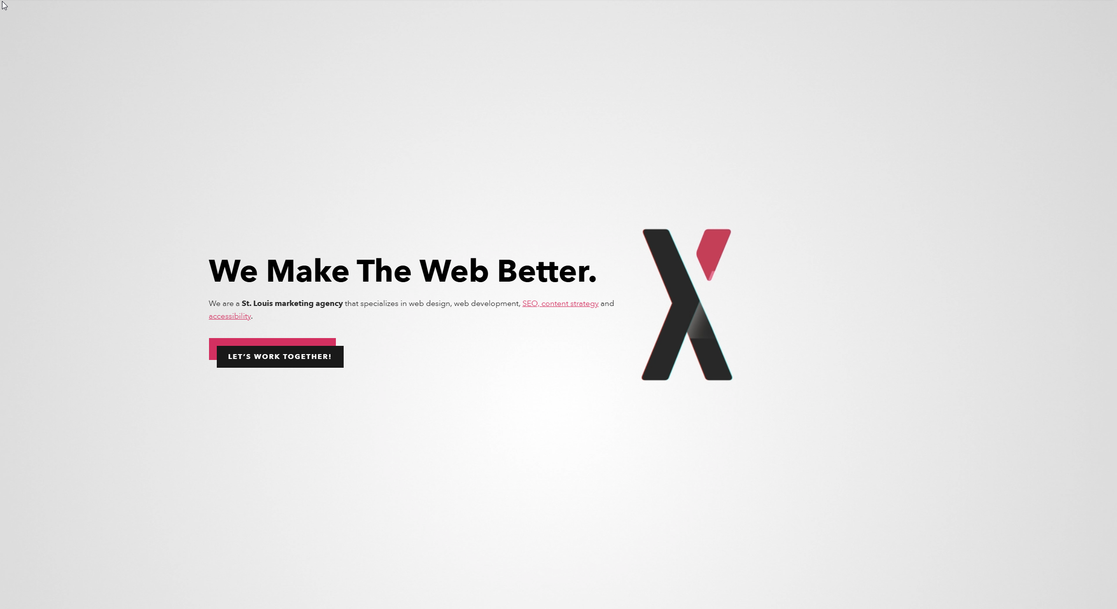 Matchbox Design Group: An open, sleek digital agency layout with layered animations and bright accents.
 -
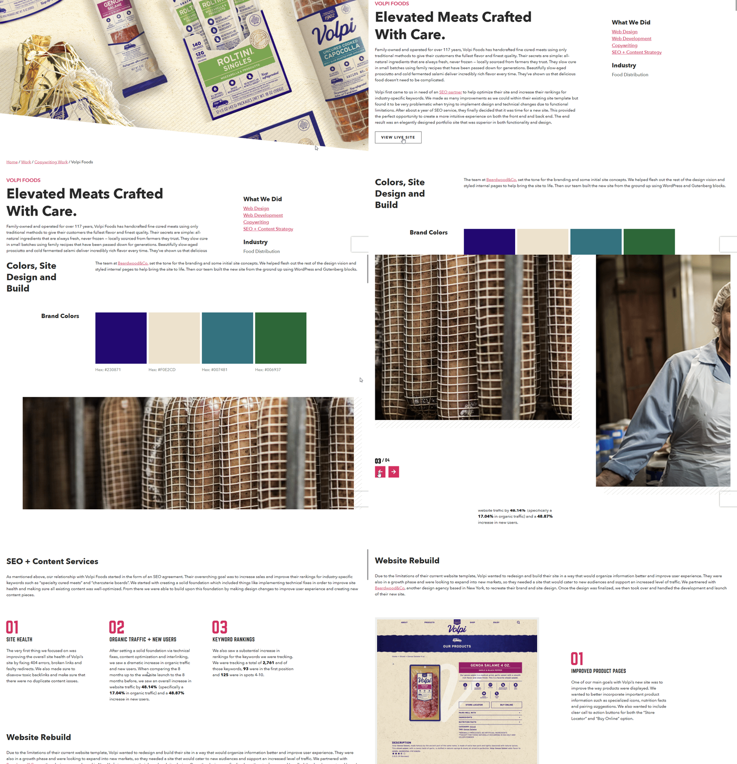
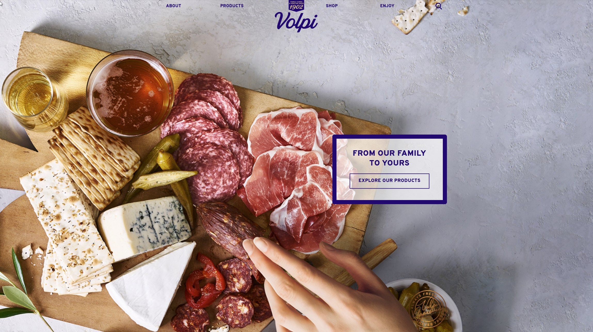 Volpi Foods: An image-forward design for an artisan cured meat brand, featuring an aged textured style that reflected their packaging design refresh.
 -
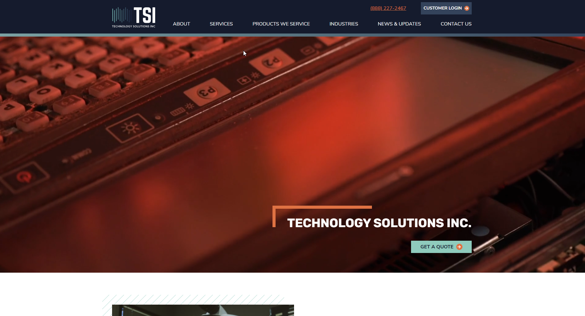 Technology Solutions Inc: A techno but professional marketing site for a technical repair services company.
Imperial Sports
After helping Imperial with website support and feature requests for years, I was genuinely excited to get to work closely with them on their digital redesign. I knew that this was the chance to help deliver the vision for their storefront that they had been working toward for years.
This included an extensive redesign and re-implementation of their WooCommerce templates, rebuilt from the ground up. I styled for sleek and smooth with the animations, wanting something sophisticated but controlled.
Matchbox Design Group
After many years of light-heartedly identifying with the proverb of "the cobbler's children have no shoes", the team was incredibly excited for the brand's first redesign in years.
We worked closely with our internal designer on getting the details just right. This included a variety of animations for different hover and interaction states.
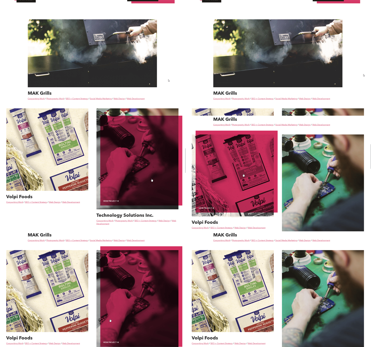
Volpi Foods
Handed a beautiful textured design from another agency, I led the team to implement Volpi's new website design.
Accomplished fully with custom blocks, I focused on clean section transitions no matter which blocks were sequenced. Using ::before and ::after elements to create jagged SVG edges gave each section an organic, ripped-edge feel.
The product page design given to us beautifully mirrored their new packaging, and so it was incredibly fun to recreate digitally.

TSI Services
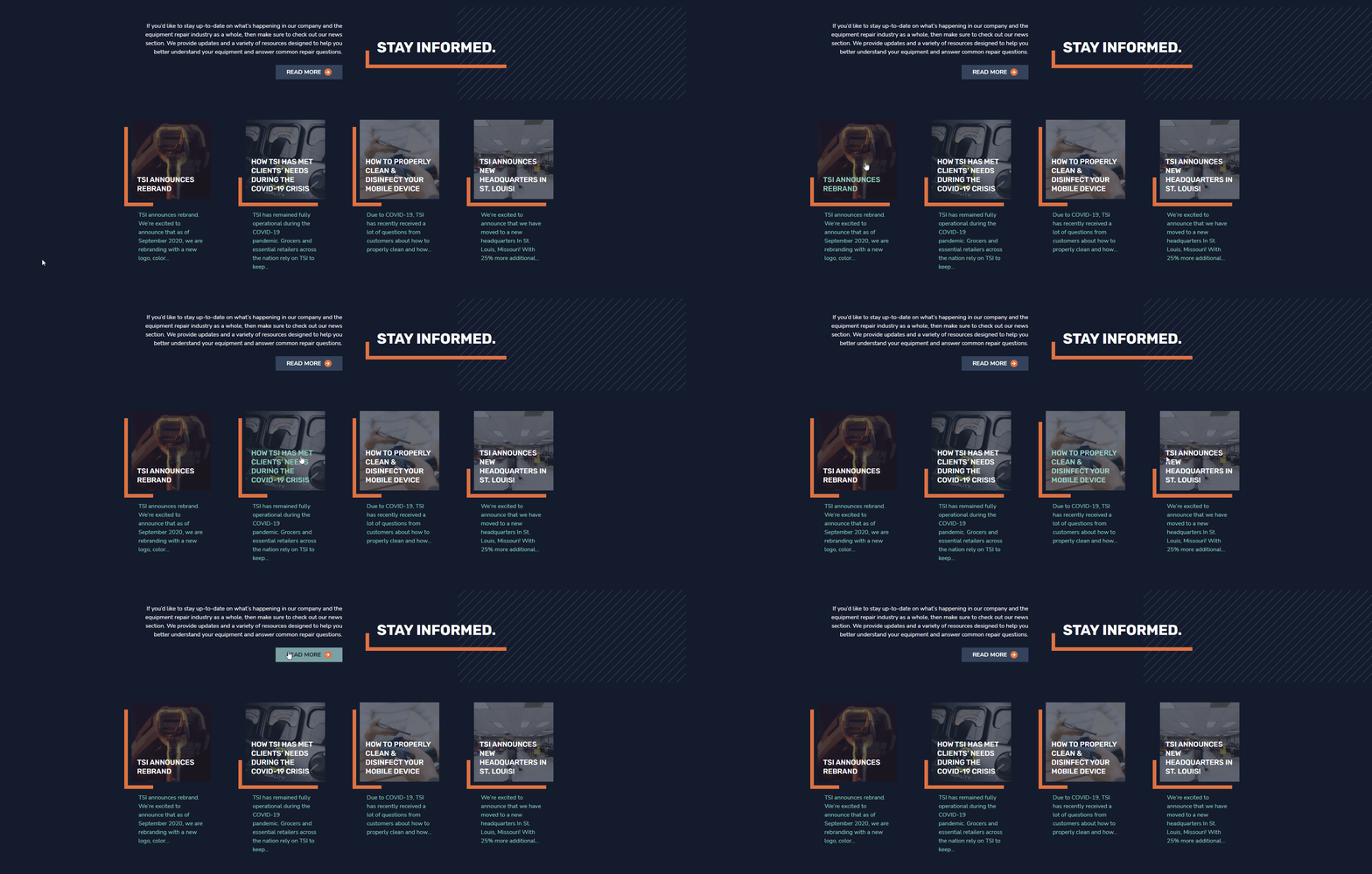
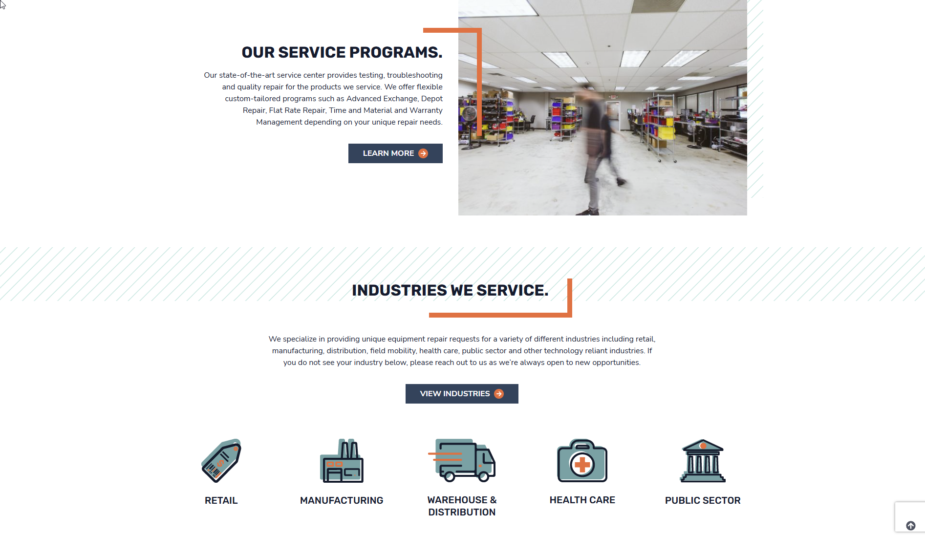
The design comps for TSI were sleek and beautiful, and the end result grew into the same. This one included some neat tricks, like the utility class system for corner borders. We scaffolded an easy setup for quickly applying the borders to elements (top-left, top-right, bottom-left, bottom-right) and curated their values to capture the design's intent and proprotions, no matter the size of the content.
With the corner borders simply being pseudo-element boxes, it was easy to animate their widths and heights to an inverse to give the feeling of the borders "sliding" around the element.
WordPress Tech
The agency used an internally-standardized stack for each custom theme, including:
- Advanced Custom Fields for settings interfaces and custom blocks
- TailwindCSS for lightning-fast styling work
- Roots' Bedrock and Sage, which reorganizes the WordPress directory structure into a more modern project structure and Laravel Blade templating
- WooCommerce for handling e-commerce aspects of WordPress solutions
Despite utilizing WordPress and some major plugins to prevent from reinvention of the wheel, many of these themes included robust features and settings-based layouts that required deep custom PHP work.
Breaking Down Design Comps
After years of work, I've developed my own personal system for looking at given design comps and tackling them.
Function first, then form.
While I strove to collaboratively include development early in design processes, working with clients often meant changes to design (and promised functionality) on a short deadline.
Many customers come to us with more than just visual concerns; a common frustration point is that their websites are a pain to update. I want to make sure that we create something actually usable for them that addresses this concern, rather than another headache they have to train someone on.
When receiving a comp, I look at the types of content intended to be on a page, and ensure that we have the CMS scaffolding to easily accept that content. I think about things like:
- How often will this content need to be updated?
- What kind of content would be useful to be able to include in a given section outside of what the comps show?
- Can the data be structured so that content doesn't need to be repeated or re-entered?
- Can certain data be normalized into CMS content types to put all of an items editables into one editing screen?
- How can a large amount of content be streamlined in the editor to prevent overwhelm?
An editor's experience is just as important as a frontend user's. In an agency setting that offers ongoing website support, editing problems addressed early in the development process prevent issues and requests later on. We make websites to be seen and to be used, so it's important to make the "using" as pleasant as possible!
Codifying a design system
With content considered as a source of data, I then look at the whole of the design presented. I look for:
- Repeated elements that can be codified into utility class systems
- Logical breaks in content and layouts that can be used to create a library of reusable components (in scenarios where it was not designed in a component-first manner)
- Spacing proportions and values that will inform the rhythm of the elements
- Element states, ensuring that visions for all states of an element are accounted and planned for
- Complex elements whose experiences would need to be preserved on mobile
- Accessibility concerns like color contrast, and where the logical reading order of an element might differ from its DOM state
These are the critical questions I look for answers to. Laying a solid foundation for a design system saves critical developer hours, and makes implementing much faster. It makes it easy to make sweeping changes to similar elements should the client request any.
Mobile-first, always
I would often find myself in situations with desktop comps, but no mobile designs. It would fall to development to intuit robust mobile solutions for complex desktop layouts.
This is where I find my trained design sense to be immensely useful. Rather than looking at the exact values of a design, I look to the intent of the design, whether documented or implied, and find a solution from there. This thoughtful intent determines the order of content as side-by-side elements break down, and the hierarchy and rhythm of the mobile experience.
Using this skill, I'm able to take a mobile prototype back to a designer and run it by them for additional feedback and ideation, all with minimal coding time spent.
Precision through proportion
I highly value pixel-perfect implementation in designs. I want a designer to see the finished product and feel the experience on the screen exactly how they envisioned it.
However, with a veritable menagerie of screen sizes in the world, designers can't provide comps for everything. For every screen size intentionally designed, there will always be viewing sizes in-between. As a developer, I often find these screen sizes on my own devices as I work, requiring a creative re-implementation of a design at a new scale.
When considering this, I look back to the intent of the design as mentioned earlier. I pair this with the proportions in the given screens to create a faithful version of the design that maintains its creative vision at every pixel in-between.
Still reading?
Thanks for sticking around to indulge in my thoughts. I love this kind of frontend implementation work, and would love to continue to expand my craft with more complex work. If you've got complex visual problems in need of solving, please reach out!
Contact me on LinkedIn